Your website has three seconds. That is the window between a visitor landing on your page and deciding whether to stay or hit the back button. In 2026, with attention spans shorter than ever and competition one click away, the difference between a website that converts and one that repels visitors comes down to a handful of design decisions that most businesses get wrong.
We have audited hundreds of business websites across Sydney over the past year. The patterns are remarkably consistent: the sites that generate leads and bookings share a specific set of characteristics, while the ones bleeding visitors all make the same avoidable mistakes. Here is what we have found.
The 3-Second Rule: What Makes Visitors Stay
Google research confirms what every web designer already knows intuitively: 53% of mobile users abandon a site that takes longer than 3 seconds to load. But load time is only half the equation. Even if your site loads instantly, visitors are making a snap judgment about your credibility based on visual cues alone.
In that three-second window, visitors are subconsciously answering three questions: Is this professional? Can I trust this business? Can I find what I need? If the answer to any of those is no, they leave. They do not scroll. They do not give you the benefit of the doubt. They leave.
What makes them stay? A clear value proposition above the fold. A clean, uncluttered layout that guides the eye. Professional imagery that feels authentic. A visible call-to-action that tells them exactly what to do next. And critically, a design that loads fast and looks sharp on the device they are actually using, which in 2026 is a mobile phone roughly 75% of the time.
Speed Kills (or Saves): The Conversion Cost of Every Second
Here is a number that should make every business owner pay attention: every additional second of page load time costs approximately 7% in conversions. That is not a theory. That is data from large-scale studies by Google, Amazon, and Walmart, confirmed repeatedly across industries.
For a Sydney business generating $10,000 per month through its website, a site that loads in 5 seconds instead of 2 is costing roughly $2,100 per month in lost revenue. Over a year, that is more than $25,000 evaporating because of slow hosting, unoptimised images, or bloated third-party scripts.
Core Web Vitals and SEO
Google's Core Web Vitals are no longer optional. Since the page experience update, Largest Contentful Paint (LCP), First Input Delay (FID), and Cumulative Layout Shift (CLS) directly affect your search rankings. A slow, janky website does not just lose visitors who arrive; it prevents new visitors from finding you in the first place. If your LCP is above 2.5 seconds, you are handing ranking positions to faster competitors.
Design Trends That Actually Convert in 2026
Not every trend is worth following. Plenty of design fads look impressive in a portfolio but actively hurt conversion rates in the real world. Here are the trends that are backed by data and producing measurable results for businesses right now.
Clean, spacious layouts. The era of cramming every piece of information above the fold is over. Whitespace is not wasted space. It is breathing room that lets your key messages land. The highest-converting business sites in 2026 use generous spacing, clear typographic hierarchy, and restrained colour palettes that draw the eye to what matters: the call-to-action.
Social proof above the fold. Testimonials, review scores, client logos, and case study snippets placed near the top of the page have a measurable impact on conversion. When a visitor sees that other real businesses trust you, the credibility question gets answered before they even start scrolling. The best implementations feel natural, not forced: a subtle star rating, a short quote, a recognisable brand logo.
Mobile-first design. Designing for desktop and then shrinking it for mobile is a relic. In 2026, the best agencies design for the phone screen first and scale up. This means thumb-friendly buttons, single-column layouts that read naturally, and forms that take 30 seconds to complete rather than three minutes.
Clear, singular CTAs. Every page should have one primary action you want the visitor to take. Not five. Not a sidebar full of competing buttons. One clear, contrasting call-to-action that is visible without scrolling, repeated at logical intervals down the page, and unmistakably clickable.
Design Sins That Destroy Your Credibility
If the trends above build trust, the following mistakes demolish it. We see these on business websites across Sydney every single day, and every one of them is driving away potential customers.
- Generic stock photos of handshakes and boardrooms. Nothing screams "we did not invest in our website" louder than the same stock photo of two people shaking hands that appears on 50,000 other sites. Visitors spot stock imagery instantly, and it signals inauthenticity. Use real photos of your team, your workspace, your actual work. If you cannot, use illustrations or abstract visuals that at least feel intentional.
- Auto-playing audio or video. In 2026, this should not need to be said, and yet we still encounter it. Auto-playing media is the fastest way to make a visitor close your tab. It is intrusive, it is disrespectful of their environment (they might be in a meeting, on public transport, or in bed at midnight), and it is a conversion killer.
- Cluttered navigation. If your nav bar has more than six items, you have a problem. If it has dropdowns with 20+ sub-items, you have a serious problem. Confused visitors do not click more. They leave. Simplify ruthlessly. The best navigation structures in 2026 have four to five items maximum.
- Missing or buried contact information. If a visitor has to click through three pages to find your phone number, you have already lost them. Contact details should be accessible from every single page: in the header, in the footer, and on a dedicated contact page that is one click away from anywhere on the site.
- No HTTPS. A website without SSL in 2026 is a website that Google flags as "Not Secure" in the browser bar. For any business asking customers to submit enquiry forms, make purchases, or share personal information, this is an immediate deal-breaker. If your site still runs on HTTP, fix it today. Not next week. Today.
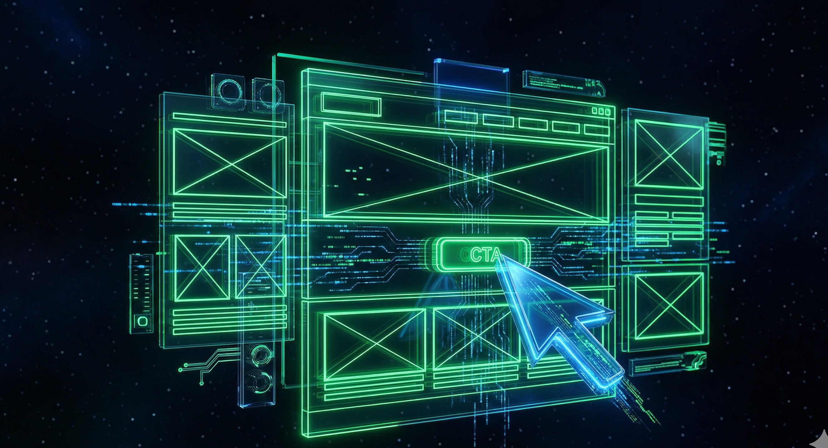
The Rise of Dark Mode and Bold Aesthetics
One of the most significant shifts in web design over the past two years has been the mainstream adoption of dark mode and cyberpunk-influenced aesthetics. What started as a niche preference among tech-savvy users has become a genuine design movement, driven by younger demographics who associate clean corporate templates with boredom and distrust.
Dark backgrounds with high-contrast typography, neon accent colours, glassmorphism effects, and bold geometric layouts are no longer reserved for gaming or crypto sites. Service businesses, agencies, and even professional firms are adopting these aesthetics because they stand out. In a sea of white-background websites with blue buttons, a well-executed dark design is memorable.
The data supports it too. Dark mode reduces eye strain in low-light environments, which is when a huge portion of browsing happens. Sites offering a dark mode toggle see increased session duration and lower bounce rates during evening hours. For businesses targeting audiences under 40, bold modern design is not a gimmick; it is a competitive advantage.
The key word is well-executed. A dark design with poor contrast, illegible text, or clashing neon elements is worse than a boring white template. The aesthetics need to serve readability and conversion, not just look impressive in a design showcase.
Sydney Agency Websites: Who Gets It Right and Who Does Not
To illustrate these principles in action, let us look at how some Sydney agencies approach their own web design, because if an agency cannot get its own site right, what does that say about the work they will produce for clients?
The Level Up is a good example of a Sydney agency that leans into modern design principles. Their site loads quickly, uses bold typography, and presents a clear service offering without overwhelming the visitor. The layout guides you toward a single action: getting in touch. Social proof is visible early. The mobile experience is smooth. It practices what it preaches.
Neyox takes a different approach with heavier visual design and more aggressive animation. The aesthetic ambition is evident, but the trade-off is load time and usability. When creative execution comes at the cost of performance, it raises a question that every agency needs to answer: is the design serving the visitor or serving the portfolio? The most effective sites find a balance between visual impact and functional performance.
The lesson is consistent across every agency site we reviewed: the sites that convert best are the ones that prioritise clarity over cleverness. Impressive animations and parallax effects are meaningless if the visitor cannot figure out what you do and how to contact you within five seconds.
Your 10-Point Website Credibility Checklist
Open your website right now and check each of these. If you fail more than three, your site is actively costing you customers.
- Load time under 3 seconds — test at pagespeed.web.dev. If your LCP is above 2.5s, you need to optimise.
- Mobile responsive — open your site on your phone. Can you read everything without zooming? Can you tap every button without accidentally hitting the wrong one?
- HTTPS enabled — look for the padlock icon in your browser bar. If it says "Not Secure," fix it immediately.
- Clear value proposition above the fold — a first-time visitor should understand what you do and who you serve without scrolling.
- One clear CTA per page — is there an obvious next step? Is the button visible, contrasting, and action-oriented?
- Contact info on every page — phone number and email should be accessible from the header, footer, or both.
- No stock photos of handshakes — if you are using generic stock imagery, replace it with real photos or authentic visuals.
- Social proof visible — testimonials, reviews, or client logos should appear on your homepage, ideally near the top.
- Navigation has 6 items or fewer — if your menu is a wall of links, simplify it.
- No auto-playing media — if anything on your site makes noise without the visitor pressing play, remove it today.
How Did You Score?
If you checked all 10, your site is in strong shape. If you missed a few, each one represents a leak in your conversion funnel that is sending potential customers to competitors. The good news: most of these fixes are straightforward and can be implemented in days, not months.
Get a Free Website Audit from K&G
Not sure where your site stands? We will tell you. K&G offers a complimentary website audit for Sydney businesses that covers load speed, mobile responsiveness, SEO health, design effectiveness, and conversion optimisation. No obligation, no sales pitch disguised as a report. Just an honest assessment of what is working, what is not, and what you can do about it.
Your website is the first impression most customers will ever have of your business. In 2026, three seconds is all you get to make it count.